Good housekeeping [2025]


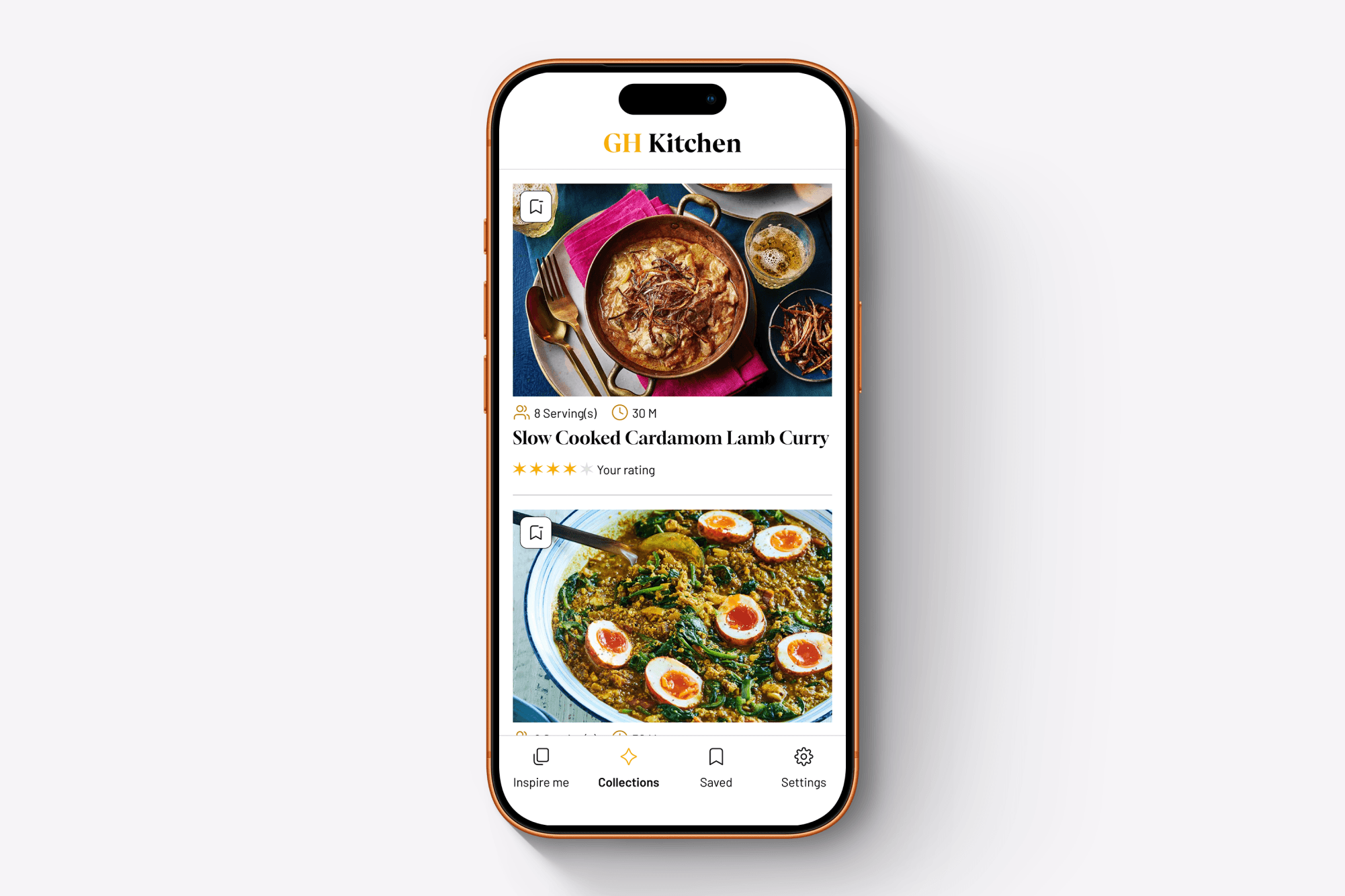
Good Housekeeping had an extensive recipe archive, but its audience needed a simpler way to discover, save and follow recipes on mobile.
The challenge was to make a large volume of content feel approachable while designing within an existing platform and creating an experience accessible to users with varying levels of digital confidence.


The Hard Parts
The decisions, constraints and trade-offs behind the final experience.
01
Making 4,000 recipes feel simple
Clarity over complexity
The challenge wasn’t a lack of content, but making a huge recipe library feel manageable. I focused the experience around a handful of clear behaviours discover, save and cook rather than exposing users to unnecessary choice or complexity.
02
New interactions had to feel familiar
Balancing discovery with confidence
Swipe-based discovery gave users a faster, more playful way to find inspiration, but the audience had varying levels of digital confidence. The interaction therefore had to remain simple, obvious and supported by familiar navigation patterns elsewhere in the app.
03
Research shaped what we prioritised
Designing around real behaviours
Rather than treating the recipe archive as a catalogue to browse, we looked at how people actually plan, save and prepare meals. Those behaviours helped prioritise personalised discovery, flexible collections and a focused Cooking Mode around the moments that mattered most.
04
The interface needed to get out of the way
Designing for the kitchen
Cooking is a very different context from casually browsing an app. During a recipe, hierarchy, readability and clear progression became more important than adding functionality. Cooking Mode stripped the experience back so users could concentrate on the next step rather than the interface.
Outcome
01
Simpler recipe discovery
Made Good Housekeeping’s extensive recipe collection easier to explore through personalised recommendations, curated collections and swipe-based inspiration.
02
Better organisation
Enabled users to save favourites and organise recipes into folders, making it quicker to return to ideas for future meals.
03
More confident cooking
Created a clear, guided cooking experience that helps users follow recipes step by step without unnecessary distractions.