
The Meow Wolf pocket companion is your totally indispensable tool for traversing the Meow Wolf multiverse. I spent around a year as lead designer, with my team helping Meow Wolf to realise their first venture into the mobile market.
Meow Wolf had previously attempted to launch a mobile product, but due to eclectic nature of their offering and the many creative visionaries involved, they were unable to realise a clear vision of what that product could be.
Meow Wolf required support in refining and implementing their numerous ideas into a mobile experience.
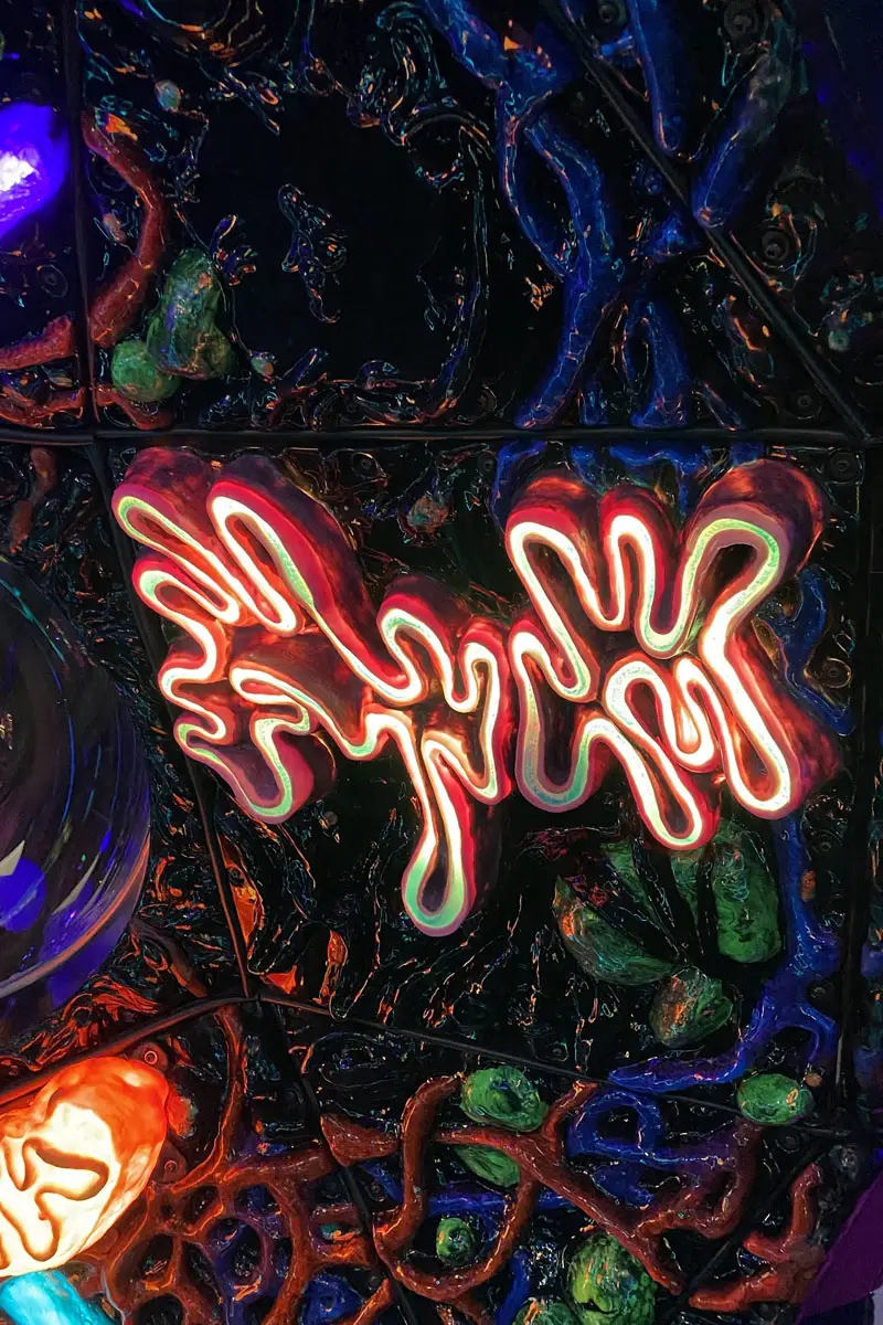
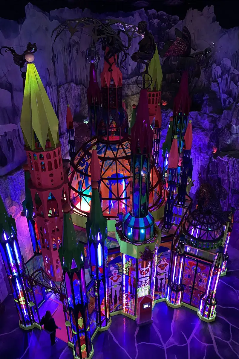
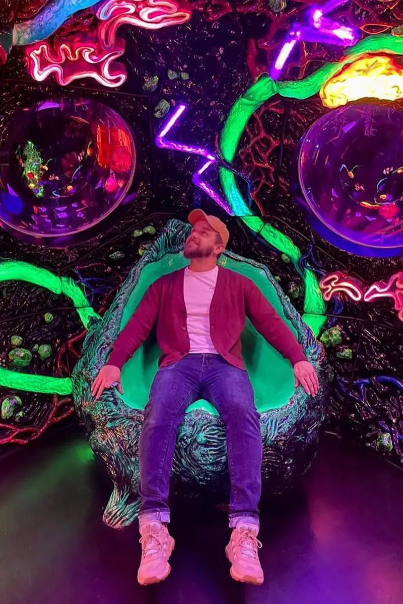
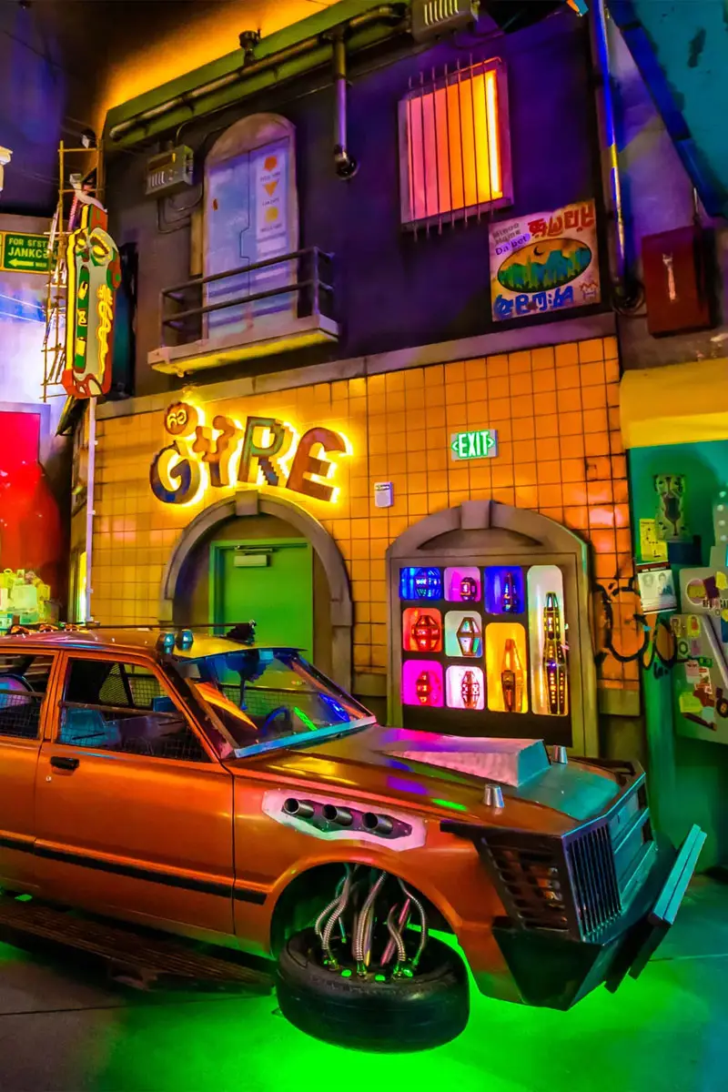
To gain deeper insights, we traveled to the U.S. for an intensive week-long visit, exploring two of their four locations in Denver and Las Vegas. There, we engaged with staff and visitors to better understand their experiences.
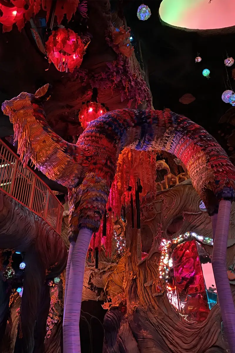
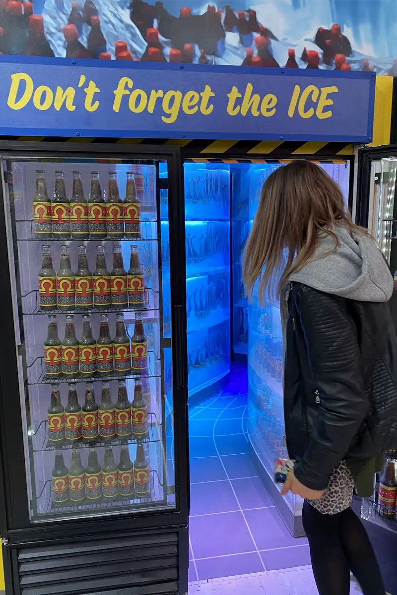
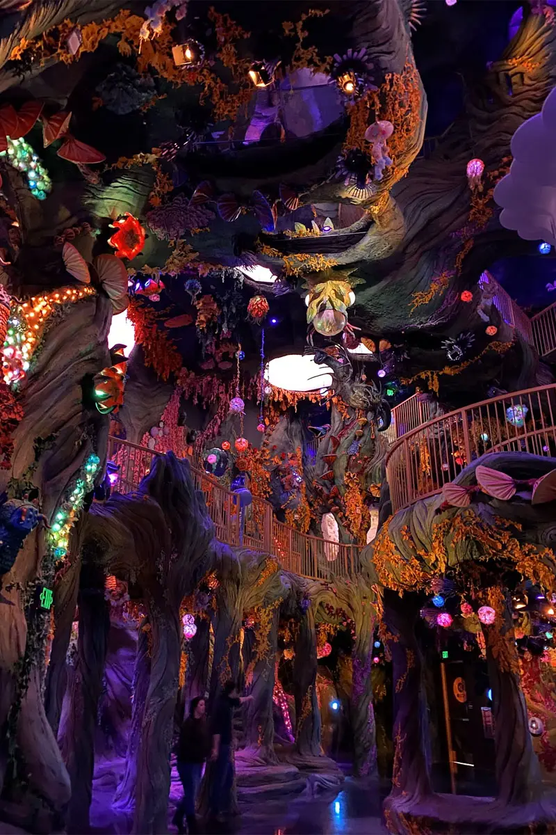
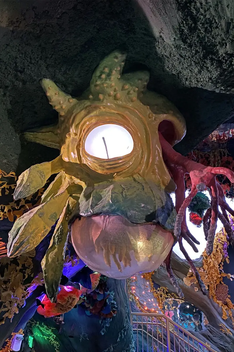
On site at Meow Wolf

a new world
Meow Wolf has created its own unique universe, blending art and performance with a complex, interconnected narrative that runs through each exhibition.
Each exhibit is designed to appear familiar, only to defy expectations as visitors explore deeper. For instance, Omega Mart (Vegas) is presented as a typical supermarket, but it’s only when you closely examine the products on the shelves (which are individual art pieces) that you realize things aren’t what they seem.
At the core of the Meow Wolf experience is the opportunity for visitors to engage with art and narratives filled with characters and intricate lore woven throughout the exhibit.
research
Upon arriving at Convergence Station and speaking with guests at the entrance, we observed frustrations with the traditional ticketing process.
We encountered our first challenge before even entering.
As we explored, we asked visitors about their reasons for coming, their understanding of the artwork, and whether they followed the storyline. Many struggled to fully engage, often pausing to read exhibit notes or use other resources, causing bottlenecks. Most were unaware of the overarching narrative.
Our research allowed us to prioritise key business opportunities and define user expectations for a potential Meow Wolf app.
A core aspect of the Meow Wolf experience is visitor interaction with immersive art and intricate narratives, featuring rich characters and lore woven throughout the exhibits.
Over time, it became evident that some guests struggled to piece everything together, often pausing to consult in-exhibit computers or other resources. This led to bottlenecks, disrupting the flow of exploration.


exploration
The primary challenge was distilling the vast, immersive material into a single mobile platform while preserving its sense of subversion.
Back home, we pulled our findings together, defined our users, pinpointed their pain points, and listed potential features—though without ranking them yet.
Researching competitors was tricky (Meow Wolf is one of a kind), but we gathered visual inspiration from our visit and mapped out the full user journey—before, during, and after.
The app needed more than just ticketing; it had to be immersive, engaging, and educational. We leaned into surrealism, interactivity, and user empowerment, designing a space where the ordinary turns extraordinary, unexpected yet intuitive.
Collaboration was key. We wanted users to add their creativity to Meow Wolf’s wild storytelling. Our goal? A playful, immersive app bursting with colour, chaos, and curiosity, a seamless blend of digital and fantastical.
Mission Statement
The Meow Wolf App is a subversive pocket portal that connects audiences deeper into imaginative realms of exploration, play and discovery
THE 'CONTAINER'
We explored various possibilities for the app’s overarching theme, envisioning it as a mobile experience infused with Meow Wolf’s signature style.
Concepts ranged from a Meow Wolf social network to a pocket-sized collaborative gallery where users could contribute their own artwork.
Ultimately, we landed on the ‘MeOw-S’. An operating system from the Meow Wolf universe—a space where nothing is predictable, yet usability remains seamless. This approach allowed us to unify their diverse art, literature, and commercial offerings into a single platform. We designed a mock Home Screen featuring an array of apps and applets, each launching unique art, stories, and interactive content.

We departed from ‘tradition’ early in our collaboration with the Meow Wolf team. As artists and art enthusiasts, many found traditional user flows and wireframes difficult to engage with or interpret.
To better accommodate and involve the team, we shifted to rapid, high-fidelity concepting.
For the OS homescreen, we explored various visual styles inspired by what we observed on-site in Vegas and Denver (see above). These included themes influenced by vaporwave, retro digital aesthetics like Windows 98, and sci-fi-inspired interfaces.
Our ultimate goal was to create something that felt familiar to users while simultaneously subverting their expectations—much like the Meow Wolf exhibitions themselves.

MINI APPS
The OS concept afforded us the opportunity to produce several mini apps or applets which lived within the ‘MeOw-S’.
These applets would serve as containers to present Meow Wolf’s content to it’s customers in a familiar (but subverted) medium.
Some of the earlier applet ideas included a social media app presented as a side scrolling, 8-bit game, a Siri-like companion AI to join you on your journey through the app and a calculator which didn’t function as you’d expect, with missing keys you’d have to find elsewhere in the app.


Exploration for a radio applet (above), playing Meow Wolf related music and sounds. Users would be able to unlock new audio by discovering frequencies around each exhibit. (Below) several early ideas we explored for applets on the MeOw-S.


gyre
One of the first applets we settled on was the Gyre. A video based piece found at Convergence Station.
Gyre is presented in exhibition as an intercom for an apartment/tenement building for 2,306,490,360,608 “unlisted residents” and 29 who are listed in the intercom directory.
Using the intercom with the correct directory code ‘connects’ you to one of the residents where you can then take a peek into their world.
We wanted to mimic Gyre’s interactivity and visual style as closely as we could on mobile. Therefore we created a skeuomorphic representation of the intercom and replicated the display into the mobile UX to serve the same video content to the app’s users.


PYSCHIC SENSOR
We also collaborated with the Meow Wolf team using Bluetooth beacons that connected the art and world to the app.
Both teams collaborated closely to seamlessly integrate the app’s smart functionality with Meow Wolf’s artistic vision and concepts.
Together, we developed the Psychic Sensor. As visitors explore the space, they receive discovery tips on how to interact, along with backstory about characters and world-building lore, creating a more immersive, visitor-driven experience.
TICKETING
Another immediate success we felt we could help rectify was the ticketing system. We witnessed first hand during our visit some of the issues users faced on entry, particularly for larger group bookings.
However, the introduction of the mobile app provided a much-needed solution. The app allowed visitors to easily access and share (group bookings) their tickets, bypassing the need for physical tickets or manual check-ins. It streamlined the experience by offering quick entry, real-time updates, and helpful navigation features, ultimately improving the overall visitor experience and reducing the stress caused by the ticketing challenges.
TICKETING
Another immediate success we felt we could help rectify was the ticketing system. We witnessed first hand during our visit some of the issues users faced on entry, particularly for larger group bookings.
Many we spoke to found it difficult to navigate the traditional ticketing process, leading to confusion and frustration.
However, the introduction of the mobile app provided a much-needed solution. The app allowed visitors to easily access and share (group bookings) their tickets, bypassing the need for physical tickets or manual check-ins. It streamlined the experience by offering quick entry, real-time updates, and helpful navigation features, ultimately improving the overall visitor experience and reducing the stress caused by the ticketing challenges.


Refining the OS visual style
One of the most interesting parts of this project was working with the many passionate stakeholders on the Meow Wolf team. It was a challenge at times, but it made the process more dynamic and rewarding.
As the team were primarily comprised of artists, we found visual ideation was the best way to communicate our ideas.
We worked up extensive versions of how the app could look and behave, creating new and exciting interactions to push the envelope.


THE SOLUTION
Our final solution landed somewhere between functional and entertaining.
Features such as ticketing and access to the Meow Wolf shop gave users a practical use for the app. Whilst applets such as the Psychic Sensor, Dream TV and Gyre gave them the ability to access Meow Wolf Literature via their device during and after their visit.
Visually, we landed on a style closer to the Meow Wolf brand seen in their other literature. The main driver behind this decision was to A) keep the app on brand and B) to enhance the concept of subverting expectations.
The home screen ultimately looks like a relatively ‘normal’ home screen but once you interact things aren’t what they seem.
We included audio and motion to suggest this, but it’s once the user really dives in they get the full Meow Wolf experience, that you would in the exhibits.

What did we achieve?
Provided a functional and entertaining platform, enhancing the experience before, during and after a customer’s visit.
Streamlined and improved the ticketing system. Making entry to Meow Wolf more accessible.
Created a companion app so users could better understand the Meow Wolf artwork and lore.

